UI/UX Connecting Addicts with Narcotics Recovery Meetings
By: Michael Long
Contributors: Michael Steele, Lei Sun
Since the beginning of the internet, people have created long lists of narcotics recovery meetings. These lists of recovery meetings eventually contained some search functionality and geolocation ability. Though these lists were a huge step ahead of flyers and phone calls, they could have been improved. Our goal was to design a web/mobile app to address common issues through modern usability research. We were limited in budget with a bare-bones design/development team of three people, and since I would be doing most of the programming myself, the design needed to be simple as well as effective.
We strongly believed in lean UI methodology centered around rapid prototyping without excessive documentation. In addition, the web UI must be designed to transition easily into the responsive Bootstrap framework so that the development effort would be quick.
Research
We started by talking to addicts, addiction counselors, and specialists to find out more about the narcotics recovery process and how our app could provide maximum value. We wanted to find out why addicts have problems getting to meetings, and how we could make this process easier for them.
Findings
The first meeting is very important
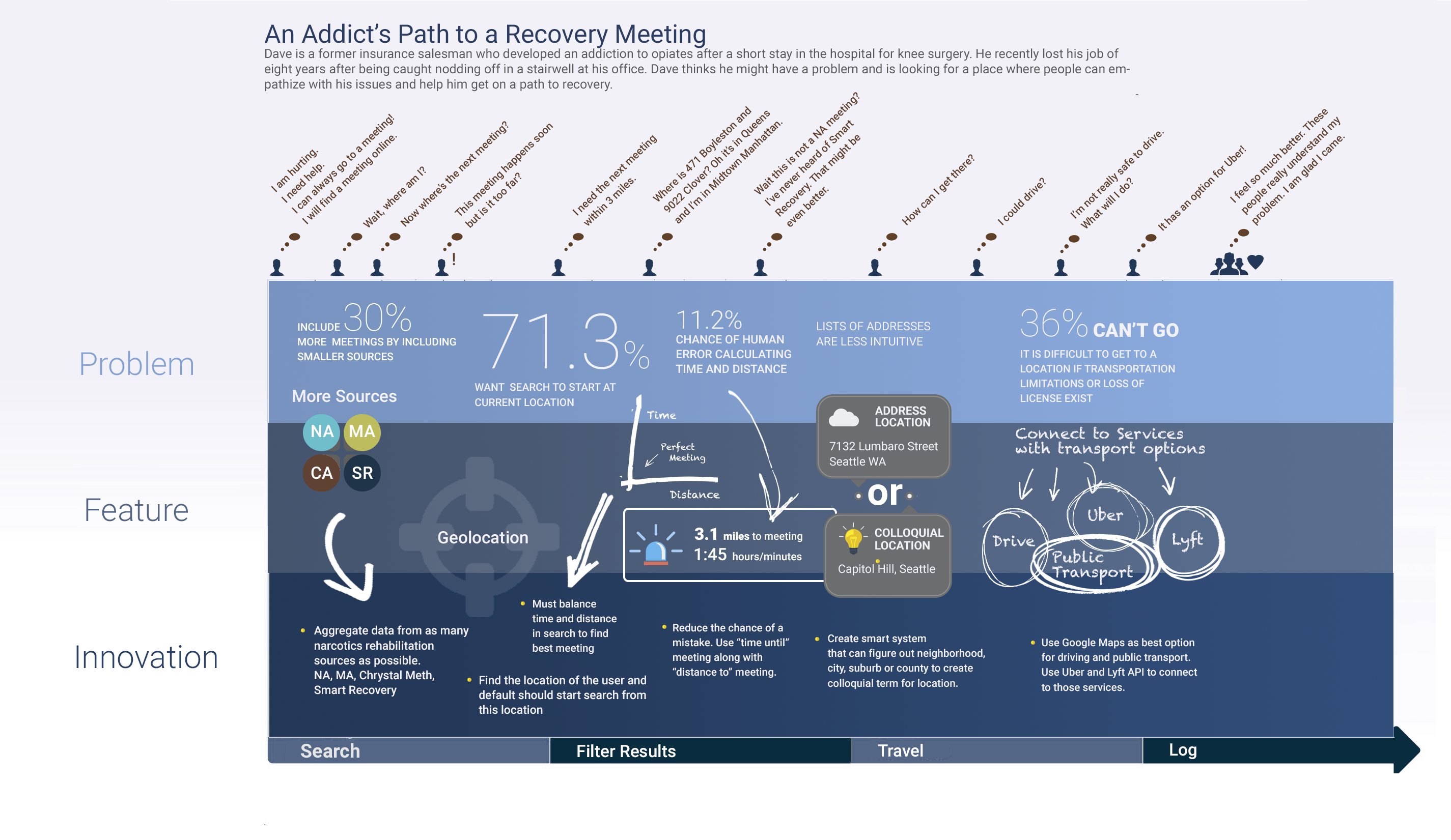
The most important action toward recovery is attending the first meeting. Many people who struggle with narcotics addiction, have had a very difficult time admitting to themselves that they have a problem. In addition, taking the necessary steps to address the problem can be equally difficult. Addicts are experts at excuses and explanations for both family members and themselves. The addict runs through every excuse available (“The meeting is too far”, “I don’t really have a problem”, “I don’t know where to go”) before they look for the help that they need.
Addicts miss meetings due to technical issues
Addicts miss meetings for a large number of reasons. For example, the addict could misread or misinterpret the time, distance or location. Even if the addict knows the correct time for the meeting, he or she may not find it, if the travel time gets miscalculated. Unless the addict has experience as a taxi or delivery driver, a map is usually required to find a location. Tiny but important details are often missed. For instance, if a meeting is specifically for women and a male addict does not read carefully, he could end up at a meeting where he may not feel welcome or comfortable.
The most common usage scenario is to search for the next, closest meeting
Should we start the app showing only today’s meetings? Are tomorrow's meetings more important to the average user? In our research, we found that 32% of the addicts we talked to said they would just go to the next meeting, on that same day. But, that was not the entire story. If we showed the next chronological meeting, then it only makes sense that we should also have limited the distance. The next meeting, across town is probably not very useful if the addict can’t get to it in time.
Addicts need as much help traveling to meetings as possible
The logistics of getting the addict successfully from their current physical location, to the meeting location could pose significant roadblocks. Many addicts miss meetings because they simply do not have the money or the needed transportation to get to the meeting.
UI/UX Goals
After extensive research, we decided that the UI/UX goals for this application should focus on faster, simpler, cheaper, and better. We needed to map the entire decision path, from the addict’s current location to the meeting site. Along that path, we sought to find the most difficult decision points and simplify them.
Goals
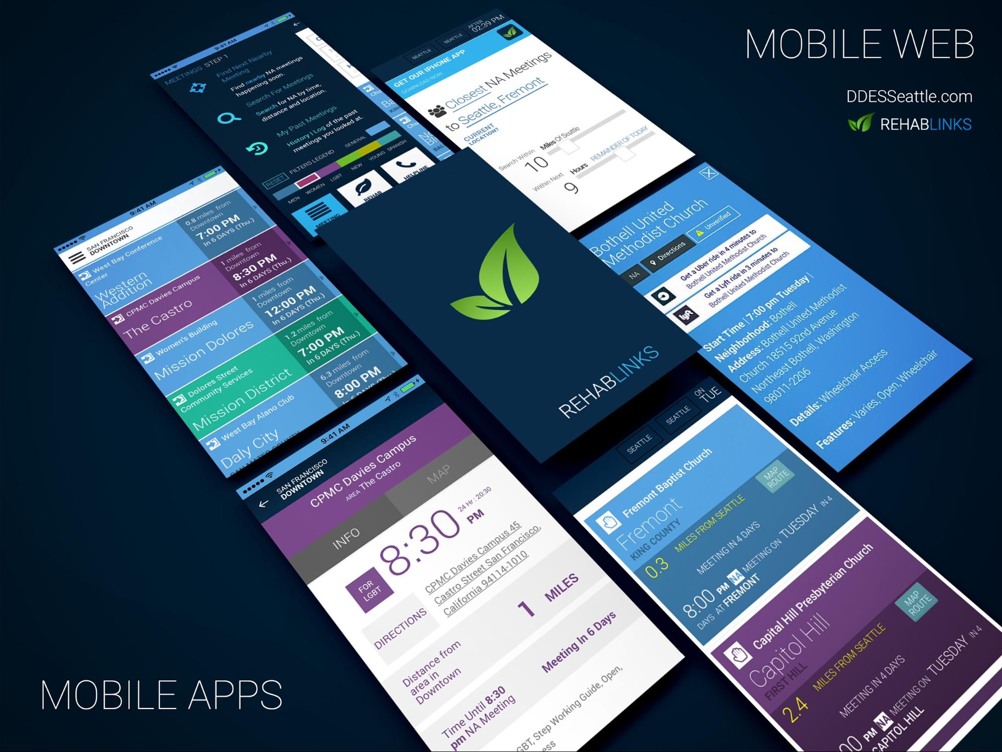
Cover as many devices and formats as possible
Did we need to build an app, website, or a mobile web app? We aimed to create as many access points to the service, as possible.
Create a simpler information architecture for logistics
Ease of use and clarity were of paramount importance when seeking recovery meetings, so we would have needed to present the information in the clearest way possible. Addresses were inherently challenging from a user perspective. User error was very common.
Clarify meeting content through color palette and iconography
We wanted to color code meetings based on most effective criteria. Again, this is difficult because each meeting has many attributes. It could be open or closed, wheelchair accessible, candlelight, LGBT, etc.
Use information design to time and distance format
Since time and distance formats were often pain points for users, we needed to simplify those as much as possible.
Provide straightforward directions and numerous travel options
We needed to find as many mapping and travel options as possible and then integrate those seamlessly into door to door travel.
Do everything we can to help addict make first trip
Anything that could be done to get an addict to the first meeting would be of foremost importance. Cost, logistics, and simplicity were all key considerations.
Optimize for mobile devices
It could be very difficult to click small areas for mobile users. We needed to provide as large a click area as possible for mobile devices and keep the interface very simple. That was especially important with maps.
Cover more meeting types than any other app
When most people think of narcotics recovery they think of Narcotics Anonymous. There are actually many other specialized meetings such as Smart Recovery, Cocaine Anonymous, and Crystal Meth Anonymous.
Our Prototype
Pages and pages of buttons, boxes, diagrams and lengthy explanations of interactions could, and usually did, fall apart as soon as the application is put into the hands of a real user. “Wordy and cumbersome deliverables become obsolete as soon as they’re created.” according to Lean UX advocate Jeff Gothelf. UX had to be holistic. It was very easy to miss the forest through the trees. You could spend a lot of time fixing a very complex problem and forget that the user may have just wanted to get out of the screen or logout. Most notably, it was much cheaper to solve usability problems in testable prototypes than in shipped code. Obviously, we needed some modicum of sketches in order to get the prototype together, but I believed in creating minimal sketches considering they will need to undergo many changes. Instead, I found more value in spending my time rapidly iterating through prototype versions.
As we tested our prototype we discovered that small but very critical details were often the key to helping a user make a quick intuitive decision. A tiny arrow in the corner telling the user that a panel can slide, a box around a piece of text telling the user a word is clickable, sped up our user tests considerably. A familiar icon like a hamburger menu was always better than creating another metaphor for a mobile menu.
Prototypes not only help you answer the questions that you set forth, but may also help you find the questions that you wouldn’t have known to ask. UI/UX designers don’t build great apps because they can wax philosophical about theories and details with each other. UI/UX designers build great apps because they talk to the people that use the app and can test their ideas in a realistic way.
One of the first things that we noticed when we began testing our prototype is that giusers want to always be able to get to the main menu from anywhere in our application. If we forced them through a wizard, they wanted to have the option of getting out at any point in the process. Equally important was the back button. We initially thought the back button should bring the user back only in the wizard. However, users wanted this to work more like a browser, we needed back buttons on every page . In retrospect, this was obvious functionality to add.
Additionally, prototypes could give you insights on what extra features are desirable. While testing our prototype, I found out that many addicts wanted a history of past meetings so they could quickly tell their parole officer where they went. Several users told me that they took Uber to their first meeting, so we knew we needed to add Uber and Lyft as integrated travel options.
Tools
We loved Adobe XD for creating quick “click path” prototypes. In more complex scenarios I used JQuery, HTML and CSS. More advanced prototypes was especially important if you a were using a responsive framework like Bootstrap. Bootstrap is a great framework for building prototypes because it is fast and easy if you have any development experience. And, it creates a much quicker development process.
When I was doing development, I hated getting UI/UX documents that ignored the responsive flow of the Bootstrap grid. If I am going to code the interface, I want to make sure it can be built without having to twist apart a Javascript UI framework for every device.
Testing and Prototype Iteration
Luckily, we had access to a large group of users to sort all of our bad ideas out of the prototype. Our office was conveniently located next to a park known to be equally populated by addicts, alcoholics and ordinary pedestrians. We trotted out of our office every few days and asked anyone we could find if they could help us test our interface.
Our testing was very simple. We asked users questions like the following:
“Can you find the next meeting?”
“Can you find a meeting on Capitol Hill on Tuesday?”
“Can you use the app to find the last meeting you attended?”
“What travel options do you have to get to a meeting?”
This led to the users asking us questions. We timed the results when we could even get results. Sometimes the users simply got stuck on a screen when we asked a question and the time didn’t matter. Our goal was to get the app to the point that the new users no longer had any questions and could click through each screen with no longer than 20 seconds of hesitation.
“How do I go back?”
“Where is the menu? I want to go back to the menu.”
“Where is the search?”
“ I don’t want to clear this search. I just want to go back to the menu and that will clear it anyway.”
How do you know you’re done?
We rebuilt the prototype screens seven times. We were able to get nine out of ten users to walk through all of our questions getting stuck or having to ask additional clarifying questions.
|
|
Mobile Prototype Example (click path) https://xd.adobe.com/view/22c4b75b-5e2d-47a4-aa8e-f55441cf0fa8/ |
Our interface meets our goals
Cover as many devices and formats as possible
We were able to produce an iPhone and Android app with mostly the same code because we used the Isomorphic Javascript framework called Meteor.js. We created a rough Beta version with Javascript/PHP code for the web app. We used the Bootstrap framework to create a decent mobile web version with the same Javascript/PHP code for the web app.
Information Architecture for Colloquial Locations
This was a very interesting problem. If you asked someone the address of their current location most likely they would have to ask someone or use a tool to find where they were unless they happened to be in a very familiar location (like their home). When you ask someone their current location, they will usually give you a colloquial location which is a could be and combinations of neighborhood, suburb, city, township, county metro or town.
“Where are you?”
|
Colloquial Location |
Location Metrics |
|
Astoria Queens |
Neighborhood, Borough |
|
Woodstock, Ulster County |
Town, County |
Color code meetings
The most important category seemed to be the demographic of the meeting. Examples are LGBT, men, women, teenagers and beginners. We decided that this is the most important category because of the nature of these meetings. A woman who shows up at a meeting for men, would probably be more upset about this than a woman who shows up at a meeting that is wheelchair accessible.
Clarify time and distance format
In addition to the time that the meeting occurs, we decided to provide the time until the meeting occurs. For instance, say the next meeting is at 2:30 PM. We decided that we should also include that the meeting occurs in 1 hour and 30 minutes. We included both a map and the actual distance from your current location to each meeting on the map. If the addict understood that the meeting occurs in 1 hour and 30 minutes then they would have the best possible metrics to get themselves to the meeting on time.
Provide straightforward directions and many travel options
Google Maps already does a great job providing point to point directions for everything from cars, public transit or even bikes. It was very easy to feed the current location and the destination with Google maps so we opted to go with Google maps. In addition, we included point to point directions directly through Uber or Lyft.
Do everything we can to make the trip to the first narcotics meeting to the last easier
This is what sets our app apart from others. Uber and Lyft provides free rides to new users through coupons. While it is not a perfect solution, we are working to provide a free coupon for the first ride.
Provide bigger click targets for mobile devices
One of the biggest problems with maps was clicking on very tiny and closely grouped map points. We decided to cluster group map points together and then allow the user to click into a group of map points to zoom in. This made the map easier to use on mobile devices.
Moving Forward
We created a usable beta that required some performance optimization and still needs advanced search functionality. We were able to succeed with limited time and funds because of two major themes in our UI/UX development. First, we created far fewer UI/UX documents through our Lean UI approach. This gave us room to do more prototyping and put the design in many more users hands. In our web version, we did more prototyping in Bootstrap so we could build an web application that naturally flowed from mobile web to a full desktop version with less development.